


Hello, everyone! You might have noticed that Codeforces has changed the logo to a new one temporarily, but it seems the admins can't decide what is better. Let's vote on the logo and see what the community itself likes! Upvote the comment for the logo you like below.


Candidate 1. Old logo:
Candidate 2. New logo, single-colored:
Credits go to kowalsk1, thanks for your work!
Candidate 3. New logo, three-colored:
Credits go to nikhil1_raghav, thanks for your work!
can you maybe make this one the same size as the others?
Done!
I like how this one currently has the most votes. A nice combination of the old and new one :)
Can you change order of colors to red-orange-blue it has more meaning to it.
Yellow is the OG you know. https://mirror.codeforces.com/blog/entry/126
Yes, This one looks great!
we can also make the colour of 'forces' in this new logo be the same colour as the original CODEFORCES logo (a little blueish).
This one isn't better. I will explain my point of view.
It is sharper, and not compact. It has much unused space if we put a minimal enclosing rectangle on it. And sharp angles may be less visible when logo is seen from distance, especially bright yellow angle.
White lines between colors are too narrwo. I suggest to make them wider, otherwise they may be invisible with lower resolution or e.g. printed on a T-shirt.
Btw, I prefer smallcaps Cᴏᴅᴇғᴏʀᴄᴇs over simple Codeforces.
Also that logo suites more for U.S. AirForces.
Is there any way to change the font to fit with the rest of the website?
To be honest, I'd better change the font of the rest of the site to match the header. That is a difficult task but if the new logo officially gets used, we'll have a chance to modernize the whole design.
Or any other related phrase :)
Wtf have you been editing!??
Combination of old and new is awesome but somewhere inside me i still like old logo.
IMO it's time to change the logo (10 years with the same logo is too much), but the new one looks weird
Yeah I thought the new one looks a bit weird too, like it doesn't belong there.
Maybe because the old one has represented the id of the most well known and iconic sports programming platform since the dawn of the sport? It will be a painful goodbye for sure :)
Personally I would love to have the fonts and quality of the new logo, but keep the three bars of the old one.
Candidate 4. Inspired by current logo design trends.
Candidate 4
Hi, thanks for writing this blog, currently kowalsk1 and I are working on other design by correcting some color codes and other improvements. It'll be similar to . Here color ratio is similar to the rating distribution on codeforces (less reds than blues).
Just testing how it looks when resized to 240px of width as the other logos:
As for the variation, I think this looks better than the one you proposed previously because there's less 'aggressive' dark red and more light blue. Good job!
Mind if I update 'Candidate 3' to the new version?
What if we put some old spices to the logo..
TBH I don't think the 'forces' part matches the rest of the logo. The logo is minimalistic and quite thin, while 'forces' is much bolder. Maybe leave 'forces' thin and move 'Sponsored by Telegram' a bit lower, such that 'Codeforces' is aligned with the logo?
I can't seem to imagine such a slim font on codeforces :/. It just looks off to me. UPD:
I think if the logo is going to be changed, the whole web's font must change as well. It's like a face with a one off feature.
Don't forget greens :)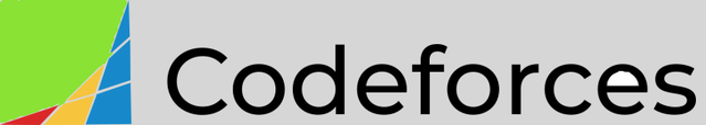
And, apparently, grays :)
purples cry in the corner
I forgot about purples :(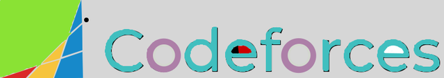
New:
And the dot is Mike
Update 2024: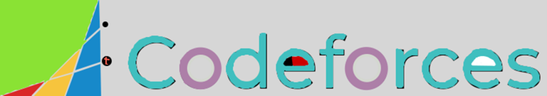
It would be cool if the "forces" of "Codeforces" (I mean "Codeforces".substr(4,6)) could be made blue and the first half be black just as the original logo.
I like this more but tbh I think this new color distribution kinda breaks the idea behind the logo.. iirc from the original blog, it was supposed to mean "growth" where you start blue and climb to top until you're red.
Candidate 6 (from Ari):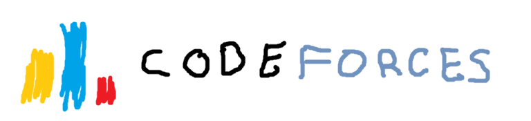
The 2020s, a new era which will see the ever-accelerating development of computer science and information technology, and Codeforces — currently the No.1 platform for competitive programming — is also changing to accommodate such growing speed by unveiling a new visual identity which will be rolled out officially in early 2021.
The image above depicted one of the candidates for the new identity — a wiggly-drawn towers of colors standing beside the handwritten text of "Codeforces". At first sight, it might appear like the identity that users have been familiar with for years — the three colors yellow, blue and red taking inspiration from the world-renowned ICPC, the different heights reflecting the diversity of skills between the participants, and the text depicting the name of the platform.
However, there are subtle changes that would make it a favorite amongst the competing candidates: as the wiggly-drawn logo makes resemblance to the handwriting of a 6-year-old kid and shrinks the size of the letter "C" to be equal to the other letters, it suggests that the platform has established itself as a competitive programming showcase where all with a passion in this gradually-popular mind sport are welcomed with equity — no discrimination on either age, nationality, religion or even programming language used.
In addition, the removal of the subtext "Sponsored by Telegram" and the distance between the two words "Code" and "Forces" in the 2020 logo represents the sustainability of the platform in a new normality after the destructive effects of the historic pandemic. In an ever-changing society of 2021, this is clearly a meaningful and well-designed logo that deserves to sit on the top as the new visual identity of this amazing platform — Codeforces.
the details are amazing!
Candidate 7 (original):
After looking for inspiration, I've finally found the perfect placement to represent the logo. The blue bar represents how people with more skill can help those who struggle with their problem solving. If this vision becomes a reality, I believe that this platform will become better for this growing community.
I do apologize for the ratio, but this masterpiece needs a wider resolution, which is also one of its purposes, to attract a wider audience and introduce them to this platform.
Are we still doing this meme in 2021 :/
I think a paint splash (yellow,blue,red) kinda design will look cool too
Candidate 9: Adhocforces