Download here Please follow the instructions. (You don't need to download the source code to your PC.)
Update: There are now two versions for black and white nutella colours. Install link
Update 2: I have make it work with the new codeforces test case feature please report any issues you may have and enjoy. I also fixed new messages being too bright.
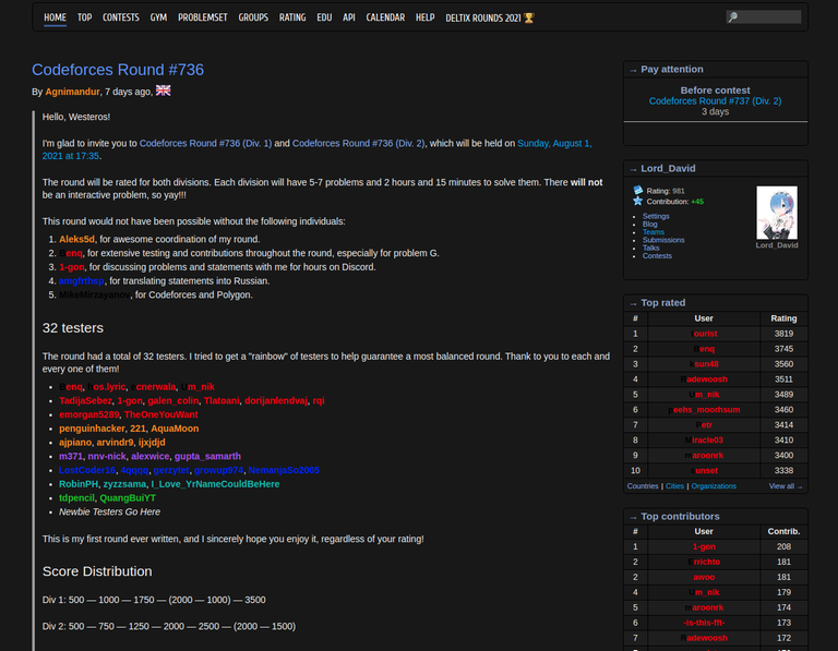
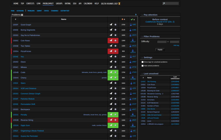
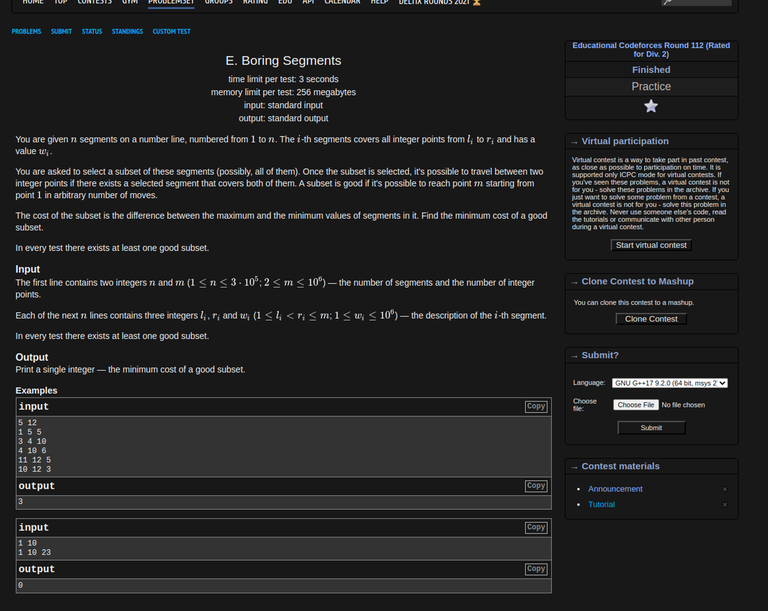
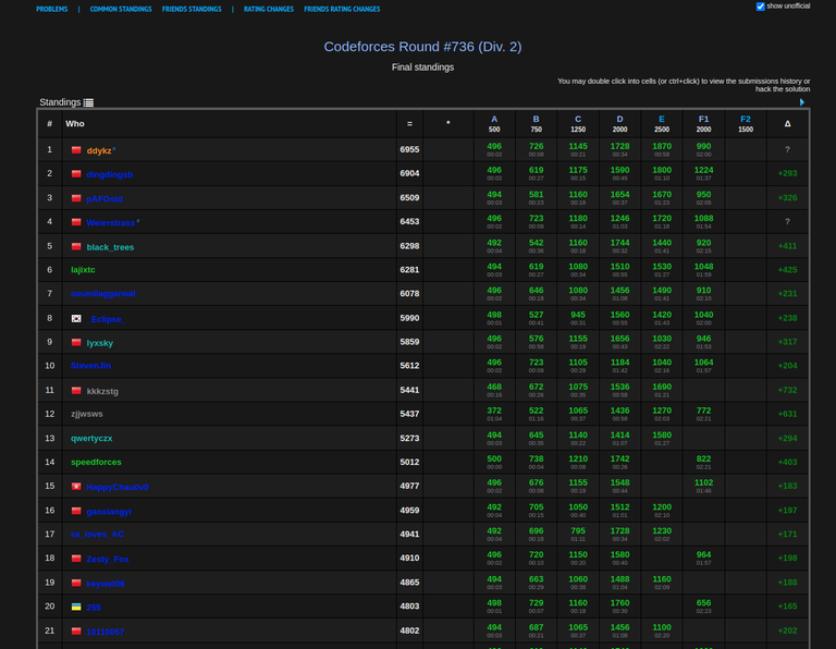
Hello everyone, so recently I've discovered a dark mode for Codeforces made by sigma_g. I liked his idea of making a dark mode, but in my opinion it didn't look very good. So I decided to fork his project and make my own version. In my opinion it looks a lot better and I hope you'll like it. I tried to make it look like the CSES dark mode with a few changes. Also I'm always open to criticism and feedback, also if anyone wants to contribute to this project feel free to message me or just submit a pull request if you've already made something. You can download and install it HERE the installation instructions are also there and it's super simple. Enjoy!


I would also like to sincerely thank sigma_g, I would not have made this without his original version.


That's just amazing !!!!
Thank you very much.
It is showing this error .
https://drive.google.com/file/d/1PehVn6j7RlviNufUXFbrPIKa5EqCrK9L/view?usp=sharing
Auto comment: topic has been updated by Lord_David (previous revision, new revision, compare).
Both are white nutella.
Should be fixed now
Yes it works now, thanks.
Thanks dude...This theme is awesome.. should be added to codeforces officially..
nvm greasemonkey is being a monkey
nice theme btw
This should be added to Codeforces officially. Thanks dude.
Insanely fast response to the new feature! (and wonderful extension overall)
While you're at it, may I request another tweak? Viewing old messages is fine, but new messages are highlighted in light blue while the text is still white. If you could fix it, that would be amazing!
Sure! Could you recommend what you'd like me to change it to? If you could give an exact colour hex code it would be ideal, but if not I completely understand. An explanation like "light grey" would also be fine. Thanks!
You could use the same color you use for new comments like the dark blue looks pretty good to me tbh
But anything works as long as the text is readable lol
For anyone reading this, it has been fixed.
This theme is fine but the code color scheme just sucks. Is there any way I can change it?
Just ran into the post and decided to try that out — have a suggestion to make all colors a bit warmer, they are very garish at the moment.
I tried to make it as similar to the CSES colours as possible. If you have any exact adjustments you'd like me make, I'll gladly look into it. Unfortunately, I don't exactly know how you want me to make it a bit warmer, so exact hex colour codes would greatly help. Thanks!
I am honestly not sure if I can equip you with exact colors, but I guess dimming some of existing colors will be great. I guess you use the same colors as the original mode has, so that's where the problem (as for me) appears. These are chosen for a white theme and on a dark theme they make too much contrast and it becomes quite hard to even read some of information.
I actually now tried it — at the morning — and it looks a bit better than yesterday at the evening. But still playing around with some colors might be helpful for your appealing product.
after the new test case feature added, dark mode doesn't seem to work very well. When, I hover over a test case, the test case doesn't appear clearly. Please look into it. This is what I am talking about
I'll look into this soon, it looks like it might be slightly more difficult to fix.
Cool. Thanks a lot!
I have tried literally all Dark Mode extensions for Codeforces, but none of them seem to affect the rating chart. I think somebody should make an extension for a dark mode for the rating chart as well.
Use Dark Reader
Thank you so much!
You are an eye saver.
I'm glad you like it.