A New Look for the New Year
Bringing Codeforces into the 21st Century with These Design Suggestions
Hello fellow codeforces users!
As we approach the end of the year, it's a time for reflection and looking forward to the future. With that in mind, I'd like to suggest some design changes for the codeforces website that could help give it a fresh, modern look for the new year.
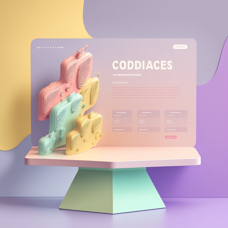
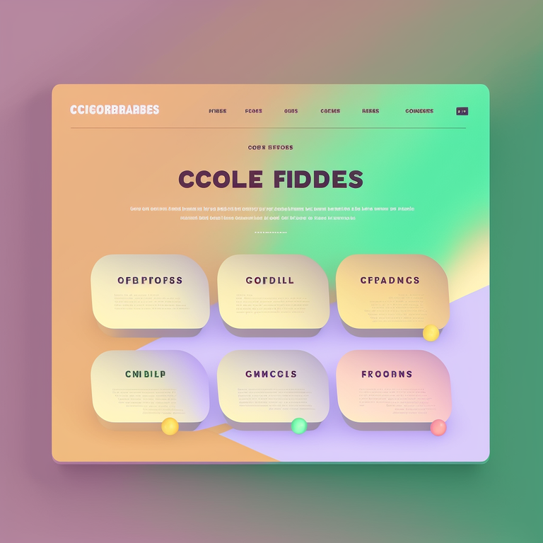
One potential change that could be made is to focus on simplicity and functionality in the design. This can help to declutter the interface and make it easier for users to find what they need. To help visualize these changes, I've attached some concept arts for the website that show how this approach could be implemented.

We also encourage other users to share their own concepts for the codeforces website in the comments section. Collaboration and fresh ideas from the community can help to bring new perspectives and inspire new approaches to the design.
As we look towards the new year, it's my hope that these design changes, or others like them, can be implemented to help modernize codeforces and make it an even better resource for all of its users. And on behalf of the entire codeforces community, I'd like to wish everyone a happy Christmas and a happy new year filled with positive changes.
If you enjoyed this blog, be sure to check out my other blog on ideas for a new codeforces logo.
Best wishes, MrPupsik


