


Hi everyone. I was curious what my rating graph would look like if I plotted it with problems solved on the X Axis instead of time. I have big gaps in my practice, and I barely do any codeforces for the majority of the year (only the occasional contest for fun).
I wrote a python script using the CLIST and Codeforces API which can graph your Rating vs Count of Problems Solved. I can also filter to see how you're improving if you only count problems of a specific rating.
This is my normal graph: 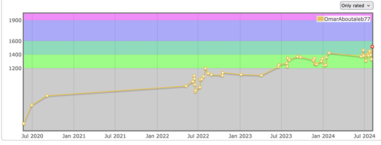
This is my Rating vs Count of Problems Solved Graph: 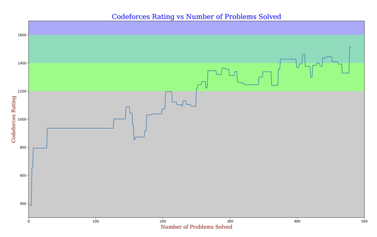
This is my Rating vs Count of Problems Solved Graph if we only count problems with a rating >= 1200*: 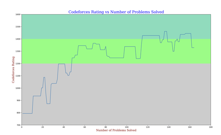
This is my Rating vs Count of Problems Solved Graph if we only count problems with a rating >= 1400*: 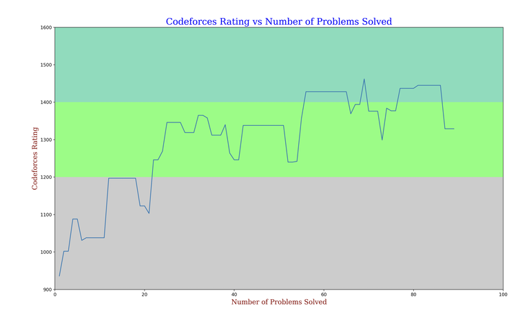
If anyone is interested I can plot your rating graph as long as you have a clist account with your codeforces account attached to it.
* Contests which have problems that don't have a rating yet aren't included.


Check mine please with all problems(same nickname).I Hope you did not just divided count of problems and placed marks on graph. :)
Here you go
Tysm :)
Can you plot mine too (same username). Thanks in advance.
Your graph
Thankyou for your time.
Hey, can u plot mine too?? Thanks
your graph
Me please, thanks!
your graph
Can you please do it for me also
your graph
do it for me please, its very important and life changing for me.
Your graph isn't really displaying properly because you don't have that many solves or contests.
your graph
Check mine too please
your graph
Thanks :)
Can you do it for me as well. Thanks.
Its interesting how it pretty much just cut the entire section where you were newbie. I guess you didn't solve many problems then. your graph
True, I used to solve codechef and gfg problems at initial days, that's why.
Can you please do it for me also
Is this an alt account? How did you get to specialist so quickly?
Your graph
I used to practice on atcoder before.
hey can you do one for me also. Thanks
Your graph
Could you please do for this id also?? Thanks
your graph
Can you please plot my graph (same username)? Thanks!
Here
Great work !! Please share graph for this id too. THANKS
Here
do it for me, thanks!
Here
am i doing good ?
9q3418
Please check for my profile too.
Here
Can I get one too? Thank you in advance!
I can't see all of your submissions for some reason. It says that you have 527 problems on your account but you only have 8 pages of submissions. Compare that to https://mirror.codeforces.com/profile/RahulHarpal who has a similar amount of problems solved but 20 pages of submissions.
It seems like problems from private groups don't show up there, don't know how to enable it (that's most of them :( )
Can you check some LGMs then? Everybody is asking about their own acc but tourist's is probably just as interesting to see.
can you check mine please with all problems , Thank you in advance!
Same problem as above comment but not as bad.
Here
Can you check mine?
Here
Check mine too please, thanks in advance.
Here
Please check mine too... Thanks in advance.
Here
Hey, can u plot mine too(same username)??Thanks in advance
Here
It will be great if you could somehow create an extension for this. It will be a cool side-project.
I might work on that in the future.
can u check mine?
here
the grpah is constant . :( same rating at 300 ques and same rating at 700 ques solved
can you please check mine? It should be cursed
Insane consistency! Any tips?
All problems
Only counting problems rated >=2000
thanks for the stats!)
I just enjoy solving I guess. Hard to come up with any tips tbh. But I have one: if you focus on trying to make problems fun and easy to solve, both the results and motivation will be higher. So when you open a problem, instead of solving it in any way, try to find a beautiful solution, so you never think about any problem as a "bad one".
I used to hate combinatorics problems, but after spending some time on them, I find them the most fun.
Can you check mine??? ty
Here
Hey, can u plot mine too?? Thanks
Here
me also .same username .
Here
Can you do mine?
Here
Analyze my account, please. Can you create a simple web app to generate a graph when needed?
Here
Do it for me please Krrishchanchal
Here
Can you do mine too please
Here
pls mine too
Here
Can you do for me too?
Here
Do it for my profile please. Thanks
Here
I'm curious. Please do one for mine as well.
Here
Quite a big difference I think
Woah, that near 2500 first problems before first 2100+. It's been wild. Also, the hiatus year scaling is kinda diminished in this plot as we use problem count as metrics, hence the recent plummeting.
Interesting data, thank you.
Can you check for me also, Thanks
Here
Mine too please.
Here
Can you do it form mine pls. Same username!!!
Here
create one for my profile(same username) :)
Here
Check mine too please (●'◡'●)
Here
Please do it for me as well :)
Here
Can you check mine too ? Thank You :)
Here
Can you plot mine ? Thanks.
Here
Do you use private groups to solve problems?
ugh I don't understand what do you mean by private groups ?
Can I get one too? Thank you in advance!
Here
Please, make it for me too, Thank you in advance!
Here
please plot my graph also.
Here
mine plz .
lmao you have one contest
CHECK mine too
Here
thanks
Check mine! Thank you in advance:)
Here
can u check mine?
Here
I just wanted to appreciate you doing good work and helping the community as well. Great job!
Bro can you plot mine?
Here
Please plot my graph. Thank you very much!!!
https://mirror.codeforces.com/blog/entry/132453
mine
https://mirror.codeforces.com/blog/entry/132453
Mine
https://mirror.codeforces.com/blog/entry/132453
hey please plot mine too brother
https://mirror.codeforces.com/blog/entry/132453
Mine also please
https://mirror.codeforces.com/blog/entry/132453
Check mine please.
https://mirror.codeforces.com/blog/entry/132453
Can u check mine too?
https://mirror.codeforces.com/blog/entry/132453
Me too please !!
https://mirror.codeforces.com/blog/entry/132453
I want my graph,please.
https://mirror.codeforces.com/blog/entry/132453
Please check mine
https://mirror.codeforces.com/blog/entry/132453
check mine please!
https://mirror.codeforces.com/blog/entry/132453
Can you do it for me ? Thanks
https://mirror.codeforces.com/blog/entry/132453
me
https://mirror.codeforces.com/blog/entry/132453
Could you please do it for me as well — i feel like it would be an interesting graph... Thanks a lot :)
https://mirror.codeforces.com/blog/entry/132453
Can you plot graph for me too ? (this id)
https://mirror.codeforces.com/blog/entry/132453
Please check mine. Thanks in advance <3
https://mirror.codeforces.com/blog/entry/132453
Very interesting graph, it really shows the amount of effort that someone has to put into improving. Please consider making this a web application!
Done :) https://mirror.codeforces.com/blog/entry/132453
Hay bro can you plot mine too ?? Thanks in advance :)
https://mirror.codeforces.com/blog/entry/132453
Hey, can you do mine? Thanks!
https://mirror.codeforces.com/blog/entry/132453
Can you share your code and some instructions on how to run it?
Try plotting mine. Would be real fun.
Great work!!!
can you check mine, please?
Hey, can u plot mine too?? Thanks
Please can you plot mine, Thank You in advance.
codeforcesplot.live
can u plot mine
codeforcesplot.live
Please me)
codeforcesplot.live
check mine
codeforcesplot.live
Can you please do mine? Thanks a ton!!!
codeforcesplot.live
If its not late, can you do one for me as well please?
codeforcesplot.live