This post in Code Jam group
Hi all! This year, Google has again decided to change Code Jam user interface. The new interface has already been used for Code Jam to I/O for Women and Kick Start rounds, and from what I saw, it is even worse than the last year. Let's start.
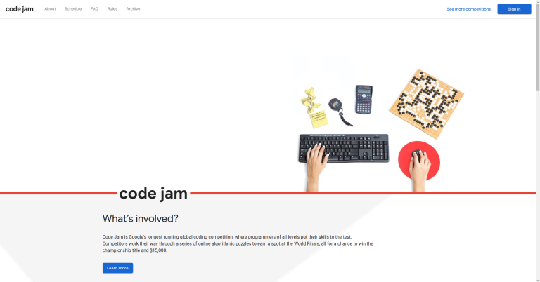
This is what I saw when I opened Code Jam main page. This year it uses even longer domain name, codingcompetitions.withgoogle.com, and some text seems to be missing. After some investigation, I found that this occurs when a browser is configured to block third-party cookies. I configure my browser this way because I don't want some companies to track me around, and for nearly all sites, this causes no issues. On some sites, blocking third-party cookies causes single sign-on to stop working, but this is understandable. Code Jam website is the first one that I saw such that blocking third-party cookies breaks it so much that you can't even read text (note: looks like this have been fixed, and now the website displays a warning instead).
After getting the text to appear, I struggled with some login problems and finally got to the competition interface (this screenshot was taken after the round, but it looked almost like that during the competition as well):
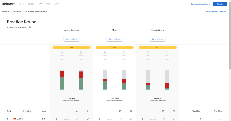
Usually, when you enter a round, you expect to see the problems. This year, you start a round with a scoreboard. To get to the problems, you need to click one of the "Open problem" buttons. Doesn't matter which one: you would be able to switch between problems from the dashboard. Here it is:
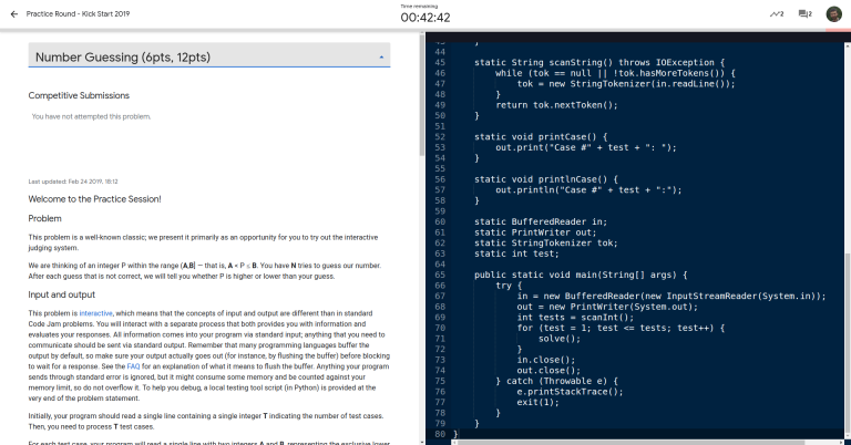
As you see, in this new version there is a code editor that always takes half of your screen space. No way to resize or hide it. Doesn't matter if you want to use it or not. I, for instance, prefer to use a real IDE, because it has syntax highlighting and completion and refactoring and I can run the code locally and IT DOESN'T FORCE ME TO USE WHITE TEXT ON BLUE BACKGROUND. Also, in the old interface, there was a side bar for switching between problems, and in the older version it also showed submission statistics and the number of new announcements, but now this is all gone.
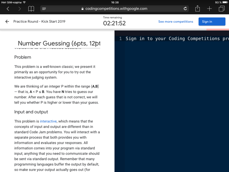
Side note: suppose that you just want to read the problems, and all you got is a tablet.
Sorry, the editor, despite being completely useless, still wastes half of your screen space. Also, looks like the problem name doesn't fit into the provided space.
Back to the previous screen.
Do you see a submit button? Me neither. It took quite some time for me to realize that to be able to submit your solutions, you have to register TWICE: once to enter your information into the new website, and once more to actually register for the competition. Otherwise, you can type the code, but the panel with submit button (and a couple of other buttons) is hidden. After I registered properly, the panel appeared (but my code disappeared, fortunately, I had it saved to a file). Then I could finally submit it.
Now, back to the scoreboard.
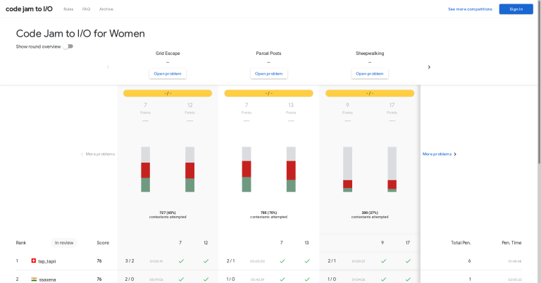
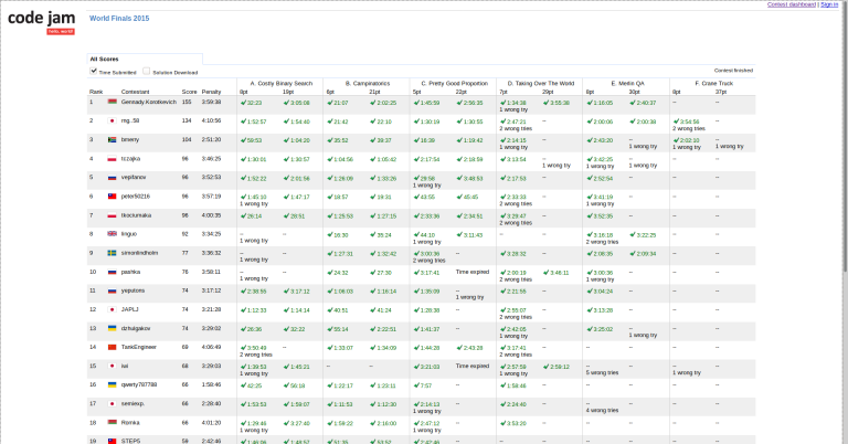
This is the scoreboard of this year's Code Jam to I/O for Women round. It has four problems, but you can only see three at a time. Apparently, the person who designed this is as bad in using your screen space as Windows 10 is in using your RAM. Perhaps they should learn from guys who designed this:
The old version easily fits six problems, and has space for one or two more. And even the font size is almost the same! Now, on top of the scoreboard, there are some big useless graphs. To see the actual scoreboard, you have to scroll down. For comparison, the old interface displays submission statistics below the scoreboard, as an additional row. Codeforces is doing the same.
Another change is the number of rows you can see on a single scoreboard page. On Codeforces, you can see up to 200 rows at once, which is reasonable for a round with several thousands of participants, and works for smaller rounds as well. In the old Code Jam interface, it was possible to see 30 rows at once. Now, there is a selector that switches between 10 and 20, and it doesn't even work until you switch between pages (looks like this had been fixed recently).
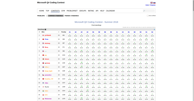
Here is another example of a well designed scoreboard:
Also, as I scroll the scoreboard, I have about 40% of my screen covered by the heading which doesn't scroll, which is way too much.
Now about round overview and problem analysis. Instead of being in a single convenient place, this information is now sprinkled around the interface. To see the overview, you need to click a slider on top of the scoreboard, and the overview will appear in place of those big useless graphs. To see the analysis, go to a problem and click an analysis "tab" above the text. Again, I like the old version so much more.
All in all, the new interface is worse than the old one in nearly every respect. So, what can be done to make it better? Here are some suggestions:
- Looks like Code Jam team already noticed that some people block third-party cookies, and made the website show a warning in this case. Still, it would be awesome if it were possible to actually log in without third-party cookies or, at least, with first-party isolation (currently, no warning is shown in this case, but login doesn't work).
- When entering a round, users should be directed to the problems, not to the scoreboard. This is how it worked in all previous versions, and this is how it should work. Also, the old version had a nice feature: it was possible to open the dashboard in advance of the round, and have the problems load automatically when it starts. I'd like to have this feature in the new version as well.
- Something has to be done with the code editor. Perhaps it should be put below the problem statement, or into a separate tab. I would also suggest to allow those users who don't need an editor to hide it completely, and to switch to an interface that supports submitting only from a file (this is how it was done before 2018).
- The editor should not be displayed if the user is not logged in, or not registered for the round. Instead, they should see a message stating that. Currently, a message is displayed in an editor, and only if the user is not logged in.
- There should be a sidebar on the left, with tabs for switching between the problems. It may show additional information as well. The old version had submission statistics and a mini-scoreboard in a sidebar, which I find quite useful.
- In the new interface, there is a top bar, which doesn't scroll. I think that it is not useful enough to always be on the screen, so it should be made to scroll with the page.
- There should be an option to receive desktop notifications when a submission is judged. Also, there should be notifications when there is an announcement, and when problem statement is changed. During the previous years, there were multiple occasions when problem statements were changed during the round without any notification whatsoever, and it was necessary to reload the page to see the changes.
- The scoreboard should be made to look better. It should be made to show more than three problems at once, and preferably at least 100 rows per page. Submission statistics should appear below the scoreboard, not above. The part of the header that remains on the top of the screen while the page is scrolled should be at most as tall as a single row.
- Round overview should be on its own page, not tucked above the scoreboard.
- Switching between the problems and the scoreboard should be more straightforward. Currently, to switch to the scoreboard, you have to press a left arrow in the top left corner of the screen, which is pretty unintuitive. The old "Contest scoreboard"/"Contest dashboard" links are much better.




How do you actually login to the page with Google Chrome? Ironically I could only login using the much hated Microsoft Edge to login, and I have already missed kickstart rounds due to this. Even worse, the "Contact Us" button only pops up a blank page.
Last time I checked (which was during the practice round), logging in works fine in Chromium (if third-party cookies are enabled). The "Contact Us" button in the bottom of this page is a
mailtolink, which should open in your email client. If it doesn't work, you can manually send an email to kickstart@google.com or codejam@google.com.Weird ... It seems that Ghostery decides to block most things related to Google.
Not such a bad decision when you consider how much tracking shit Google has.
I suggest something more advanced like uMatrix that lets you configure what should be allowed.
I tried to register on Kick Start using chrome but I didn't succeed, chrome's console said some errors on page, but nothing happened when I clicked on a "register" button. Btw I was able to register to Code Jam without any problems.
I experienced the same issue with viewing the results of a contest from my phone. The website is pretty looking, but that's not what we want, we want "Effective" website.
Just look to Codeforces, it's not nice looking but it's one of the most effective designs I have experienced. I think Google should take a look into CS Academy, it has the best look and one of the most effective designs. Their editor can be hidden, the colors of the website as well as the colors of the editor can be changed. You can't use the editor when you are not signed in with a very clear form that forces you to login if you want to use it. You can easily navigate through the contest, even better than Codeforces.
Google disappointed us all. kostka please look to these issues.
I was not able to log in on their site during hashcode with FireFox and eventually had to use Chrome.
Seems the issue still hasn't been resolved, and I still can't log in via Firefox. T_T
First of all, let me say that Code Jam is a great contest, but I actually calculated how much of the vertical area shown initially is useful when you click on scoreboard and you're interested in the scores ... just 8.6% https://i.ibb.co/0jPBzZb/useful.png
this is google quality