


Hi! Inspired in this blog, I wanted some data to support my thoughts, so I used codeforces API to plot some graphs. The plots show for each rating what was the average number of problems solved (for lower ratings, there a less users so some unpredictable behavior can happen).
Here, you can see the plot for Codeforces Round 651 (Div. 2):
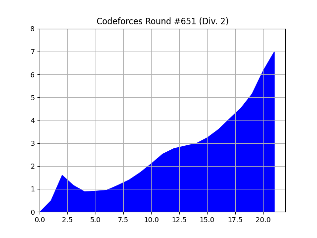
Note: The x-axis is scalled down, that means that $$$x$$$ is actually $$$100x$$$ (I made in that so that it wont get too poluted).
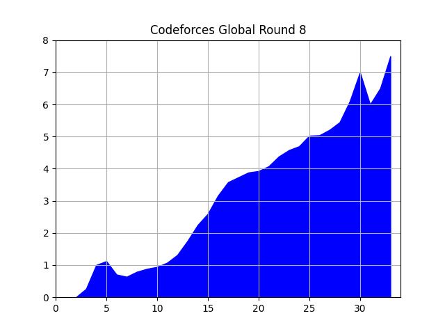
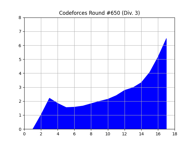
See other two plots I made:
EDIT: As said by AnandOza and uggi121, due to the new rating system, that peak in the beggining of the graphs are new accounts being registered.
UPD Here is the plot for Codeforces Round 652 (Div. 2): 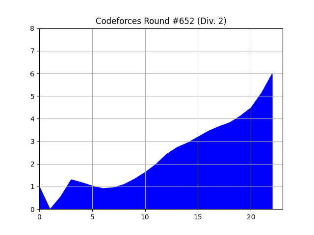


Nice, but everyone knows this so it's useless.
Says the one who posts such important blogs such as this and this.
Looks cool. Would also be nice to see versions where the X-axis is performance during the contest (you can define this as the rating R such that if you were rated R before the contest your rating wouldn't change).
Great idea! Thanks, I think I will add it!
Actually, it's quite hard to explain why there is a peak in the beginning of the plots. Any ideas?
Try plotting a simple frequency (like a histogram) overlaying it to see how many people of each rating bucket there are. If I had to guess, there are very few people with very low or very high ratings, so the graphs there are simply very noisy (so you see what looks like a meaningful peak but it's random noise on this contest).
For example, the global round has a "dip" in the LGM range but I assume that's just noise from like, one or two people.
That peak appeared in all the contests I plotted, but the rating distribution gives us some clue about what happened.
Maybe it's an artifact of Mike's new rating system where you start from 0 instead of 1500 and get +500 for your first contest. Try contests from a few months ago before this was implemented.
You are right, there are no peaks in contests before the new rating system.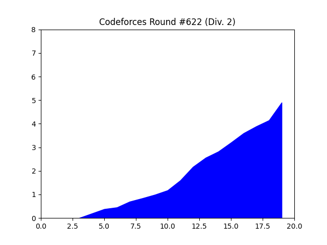
Can you edit your blog to say this?
Done!
Some users make "smurfs" — new accounts which they boost to get to their current rating for a myriad of reasons. The peak in the beginning is probably due to these users solving a high number of problems. If you considered the median number of problems solved instead, this peak should get filtered out.
Other way I can fix this is by just ignoring new accounts.
Can you do the same but in a grid? Is quite hard to see the graphs right now.
Done!
1750 users solved all the problems on div3? shit well guess i don't deserve this at all i only solved 3 LOL
No, you understood it wrong, the avarege of number of problems solved from people from rating $$$1750$$$ to $$$1800$$$ was almost $$$8$$$ problems
I think it would be a cool idea that somebody does this after every round!